7 个 Matplotlib 技巧,更好地可视化你的机器学习模型
图片作者 | ChatGPT
引言
可视化模型性能是机器学习工作流程中必不可少的一环。虽然许多从业者能够创建基本的图表,但将这些图表从简单的图表提升到能够轻松讲述机器学习模型解释和预测故事的、有见地的、高级可视化,是一项能让优秀专业人士脱颖而出的技能。作为科学和计算Python生态系统中的基础绘图工具,Matplotlib库充满了可以帮助您实现这一目标的特性。
本教程提供了7个实用的Matplotlib技巧,可以帮助您更好地理解、评估和展示您的机器学习模型。我们将超越默认设置,创建不仅美观而且信息丰富的可视化。这些技术旨在与NumPy和Scikit-learn等库顺畅集成到您的工作流程中。
这里的假设是您已经熟悉Matplotlib及其一般用法,因为我们在这里不会涵盖这些内容。相反,我们将专注于如何在7个特定的与机器学习任务相关的场景中提高您的代码技能。
由于我们将采用独立处理每个代码解决方案的方法,所以请准备好今天会多次看到import matplotlib.pyplot as plt 🙂
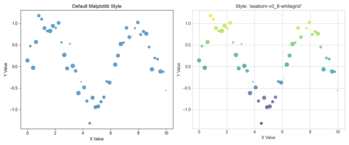
1. 应用专业样式,即时提升质感
Matplotlib的默认外观有时可能感觉有点……过时。一种简单而有效的方法是使用Matplotlib内置的样式表。只需一行代码,您就可以应用专业的样式,模仿R的ggplot或Seaborn库等流行工具的美学风格。这可以立即提高可读性和视觉吸引力。
让我们看看样式表能带来什么不同。我们将从一个基本的散点图开始,然后应用'seaborn-v0_8-whitegrid'样式。
|
1 2 3 4 5 6 7 8 9 10 11 12 13 14 15 16 17 18 19 20 21 22 23 24 25 26 27 28 29 30 31 |
import matplotlib.pyplot as plt import numpy as np # 生成一些示例数据 x = np.linspace(0, 10, 50) y = np.sin(x) + np.random.normal(0, 0.2, 50) sizes = np.random.rand(50) * 100 # 默认绘图 plt.figure(figsize=(12, 5)) plt.subplot(1, 2, 1) plt.scatter(x, y, s=sizes, alpha=0.7) plt.title('默认 Matplotlib 样式') plt.xlabel('X 值') plt.ylabel('Y 值') # 应用专业样式 plt.style.use('seaborn-v0_8-whitegrid') # 样式化绘图 plt.subplot(1, 2, 2) plt.scatter(x, y, s=sizes, alpha=0.7, c=y, cmap='viridis') plt.title("样式: 'seaborn-v0_8-whitegrid'") plt.xlabel('X 值') plt.ylabel('Y 值') plt.tight_layout() plt.show() # 如果需要,重置为默认样式以进行后续绘图 plt.style.use('default') |
生成的可视化如下
应用专业样式,即时提升质感
正如您所见,应用样式会添加网格,更改字体,并调整整体配色方案,使图表更易于解读。
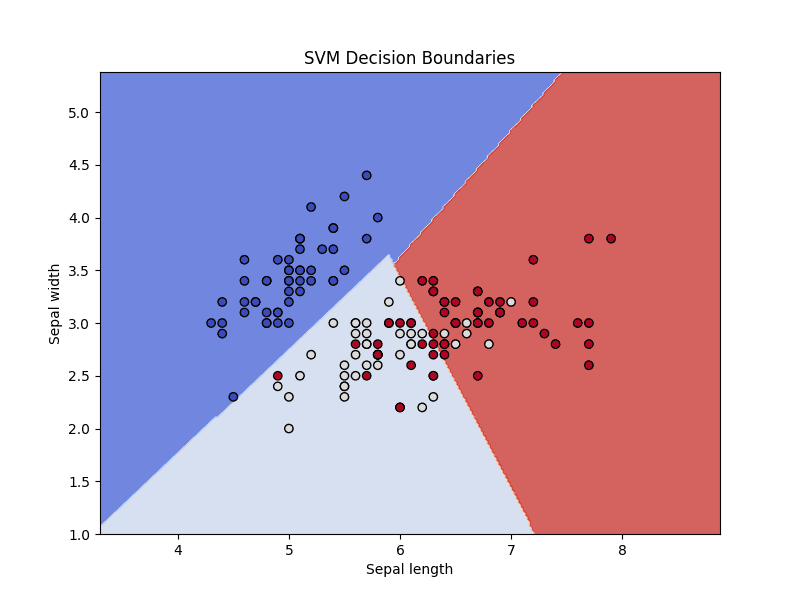
2. 可视化分类器决策边界
理解分类模型如何分隔数据是必须的。决策边界图显示了模型与每个类关联的特征空间区域。这种可视化是诊断模型如何泛化以及它可能在哪里出错的宝贵工具。
我们将在经典的Iris数据集上训练一个支持向量机(SVM),并绘制其决策边界。为了在2D中可见,我们将只使用两个特征。诀窍是创建一个点网格,让模型为每个点预测类别,然后使用plt.contourf()绘制彩色区域。
|
1 2 3 4 5 6 7 8 9 10 11 12 13 14 15 16 17 18 19 20 21 22 23 24 25 26 27 28 29 30 31 32 |
import numpy as np import matplotlib.pyplot as plt from sklearn import svm, datasets # 加载iris数据集并仅使用前两个特征 iris = datasets.load_iris() X = iris.data[:, :2] y = iris.target # 创建SVM实例并拟合数据 C = 1.0 # SVM 正则化参数 svc = svm.SVC(kernel='linear', C=C).fit(X, y) # 创建用于绘图的网格 x_min, x_max = X[:, 0].min() - 1, X[:, 0].max() + 1 y_min, y_max = X[:, 1].min() - 1, X[:, 1].max() + 1 xx, yy = np.meshgrid(np.arange(x_min, x_max, 0.02), np.arange(y_min, y_max, 0.02)) # 预测网格中每个点的类别 Z = svc.predict(np.c_[xx.ravel(), yy.ravel()]) Z = Z.reshape(xx.shape) # 绘制决策边界 plt.figure(figsize=(8, 6)) plt.contourf(xx, yy, Z, cmap=plt.cm.coolwarm, alpha=0.8) # 绘制训练点 plt.scatter(X[:, 0], X[:, 1], c=y, cmap=plt.cm.coolwarm, edgecolors='k') plt.xlabel('萼片长度') plt.ylabel('萼片宽度') plt.title('SVM 决策边界') plt.show() |
这是我们分类器决策边界的可视化
可视化分类器决策边界
这张图展示了SVM分类器如何划分特征空间,区分了三种鸢尾花。
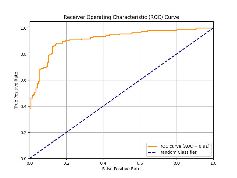
3. 绘制清晰的接收者操作特征曲线
接收者操作特征(ROC)曲线是评估二元分类器的标准工具。ROC图在各种阈值设置下,将真阳性率绘制为假阳性率。曲线下面积(AUC)提供了一个单一数字来总结模型的性能,如ROC图中所示。一个好的ROC图应包括AUC得分和用于比较的基线。
让我们使用Scikit-learn计算ROC曲线点和AUC,然后使用Matplotlib将它们清晰地绘制出来。添加一个带有AUC得分的标签可以使图表自成一体且易于理解。
|
1 2 3 4 5 6 7 8 9 10 11 12 13 14 15 16 17 18 19 20 21 22 23 24 25 26 27 28 29 30 31 32 33 |
import matplotlib.pyplot as plt from sklearn.datasets import make_classification from sklearn.model_selection import train_test_split from sklearn.linear_model import LogisticRegression from sklearn.metrics import roc_curve, roc_auc_score # 生成合成数据 X, y = make_classification(n_samples=1000, n_classes=2, random_state=42) X_train, X_test, y_train, y_test = train_test_split(X, y, test_size=0.3, random_state=42) # 训练模型 model = LogisticRegression() model.fit(X_train, y_train) # 预测概率 y_probs = model.predict_proba(X_test)[:, 1] # 计算ROC曲线和AUC fpr, tpr, thresholds = roc_curve(y_test, y_probs) auc = roc_auc_score(y_test, y_probs) # 绘制ROC曲线 plt.figure(figsize=(8, 6)) plt.plot(fpr, tpr, color='darkorange', lw=2, label=f'ROC曲线 (AUC = {auc:.2f})') plt.plot([0, 1], [0, 1], color='navy', lw=2, linestyle='--', label='随机分类器') plt.xlim([0.0, 1.0]) plt.ylim([0.0, 1.05]) plt.xlabel('假阳性率') plt.ylabel('真阳性率') plt.title('接收者操作特征(ROC)曲线') plt.legend(loc="lower right") plt.grid(True) plt.show() |
由此产生的稳健ROC曲线图如下
绘制清晰的接收者操作特征曲线
4. 构建带注释的混淆矩阵热力图
混淆矩阵是总结分类模型性能的表格。原始数字在这里很有用,但热力图可视化可以更快地发现模式,例如哪些类经常被混淆。用实际数字注释热力图既提供了快速的视觉摘要,又提供了精确的细节。
我们将使用Matplotlib的imshow()函数来创建热力图,然后遍历矩阵为每个单元格添加文本标签。
|
1 2 3 4 5 6 7 8 9 10 11 12 13 14 15 16 17 18 19 20 21 22 23 24 25 26 27 28 29 30 31 32 33 34 35 36 37 38 39 40 41 |
import numpy as np import matplotlib.pyplot as plt from sklearn.metrics import confusion_matrix from sklearn.datasets import make_classification from sklearn.model_selection import train_test_split from sklearn.ensemble import RandomForestClassifier # 生成数据并进行预测 X, y = make_classification(n_samples=1000, n_features=10, n_informative=5, n_redundant=0, n_classes=3, n_clusters_per_class=1, random_state=42) X_train, X_test, y_train, y_test = train_test_split(X, y, test_size=0.3, random_state=42) model = RandomForestClassifier(random_state=42) model.fit(X_train, y_train) y_pred = model.predict(X_test) # 计算混淆矩阵 cm = confusion_matrix(y_test, y_pred) classes = ['类别 0', '类别 1', '类别 2'] # 绘制混淆矩阵 fig, ax = plt.subplots(figsize=(8, 6)) im = ax.imshow(cm, interpolation='nearest', cmap=plt.cm.Blues) ax.figure.colorbar(im, ax=ax) ax.set(xticks=np.arange(cm.shape[1]), yticks=np.arange(cm.shape[0]), xticklabels=classes, yticklabels=classes, title='混淆矩阵', ylabel='真实标签', xlabel='预测标签') # 循环遍历数据维度并创建文本注释。 thresh = cm.max() / 2. for i in range(cm.shape[0]): for j in range(cm.shape[1]): ax.text(j, i, format(cm[i, j], 'd'), ha="center", va="center", color="white" if cm[i, j] > thresh else "black") fig.tight_layout() plt.show() |
Here is the resulting easy-to-quickly-interpret confusion matrix
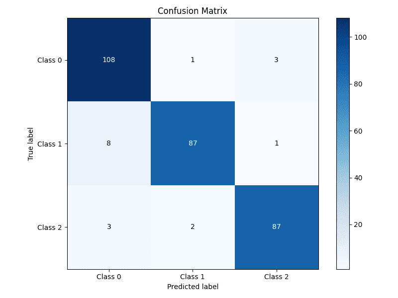
Building an annotated confusion matrix heatmap
5. Highlighting Feature Importance
For many models, especially tree-based ensembles like random forests or gradient boosting, we can extract a measure of how important each feature was in making predictions. Visualizing these scores helps in understanding the model’s behavior and guiding feature selection efforts. A horizontal bar chart is often the best choice for this task.
We’ll train a RandomForestClassifier, extract the feature importances, and display them in a sorted horizontal bar chart for easy comparison.
|
1 2 3 4 5 6 7 8 9 10 11 12 13 14 15 16 17 18 19 20 21 22 23 24 25 26 27 |
import numpy as np import matplotlib.pyplot as plt from sklearn.datasets import make_classification from sklearn.ensemble import RandomForestClassifier # 生成合成数据 X, y = make_classification(n_samples=1000, n_features=10, n_informative=5, n_redundant=0, random_state=42) # 训练模型 model = RandomForestClassifier(n_estimators=100, random_state=42) model.fit(X, y) # Get feature importances importances = model.feature_importances_ feature_names = [f'Feature {i}' for i in range(X.shape[1])] # Sort feature importances in descending order indices = np.argsort(importances)[::-1] # Plotting the feature importances plt.figure(figsize=(10, 6)) plt.title("Feature Importances") plt.barh(range(X.shape[1]), importances[indices], align="center") plt.yticks(range(X.shape[1]), [feature_names[i] for i in indices]) plt.gca().invert_yaxis() # Display the most important features at the top plt.xlabel("Importance Score") plt.show() |
Let’s take a look at the feature importances plotted
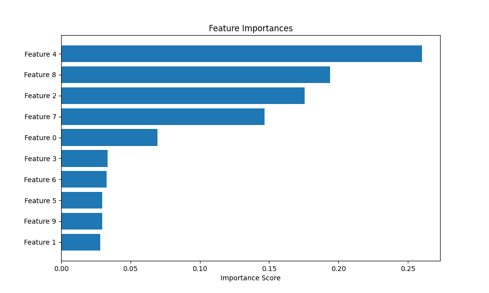
Highlighting feature importance
6. Plotting Diagnostic Learning Curves
Learning curves are a powerful tool for diagnosing whether a model is suffering from a bias problem (underfitting) or a variance problem (overfitting). They show the model’s performance on the training set and the validation set as a function of the number of training samples.
We’ll use Scikit-learn’s learning_curve utility to generate the scores and then plot them. A key trick here is to also plot the standard deviation of the scores to understand the stability of the model’s performance.
|
1 2 3 4 5 6 7 8 9 10 11 12 13 14 15 16 17 18 19 20 21 22 23 24 25 26 27 28 29 30 31 32 33 34 35 36 |
import numpy as np import matplotlib.pyplot as plt from sklearn.datasets import load_digits from sklearn.model_selection import learning_curve 从 sklearn.线性模型 导入 LogisticRegression # 加载数据 X, y = load_digits(return_X_y=True) # 定义模型 estimator = LogisticRegression(max_iter=10000, solver='liblinear') # Calculate learning curve scores train_sizes, train_scores, test_scores = learning_curve(estimator, X, y, cv=5, n_jobs=-1, train_sizes=np.linspace(.1, 1.0, 10)) # Calculate mean and standard deviation for training and test scores train_scores_mean = np.mean(train_scores, axis=1) train_scores_std = np.std(train_scores, axis=1) test_scores_mean = np.mean(test_scores, axis=1) test_scores_std = np.std(test_scores, axis=1) # Plotting the learning curve plt.figure(figsize=(10, 6)) plt.title("Learning Curve") plt.xlabel("Training examples") plt.ylabel("Score") plt.grid(True) plt.fill_between(train_sizes, train_scores_mean - train_scores_std, train_scores_mean + train_scores_std, alpha=0.1, color="r") plt.fill_between(train_sizes, test_scores_mean - test_scores_std, test_scores_mean + test_scores_std, alpha=0.1, color="g") plt.plot(train_sizes, train_scores_mean, 'o-', color="r", label="Training score") plt.plot(train_sizes, test_scores_mean, 'o-', color="g", label="Cross-validation score") plt.legend(loc="best") plt.show() |
This is the resulting learning curve plot
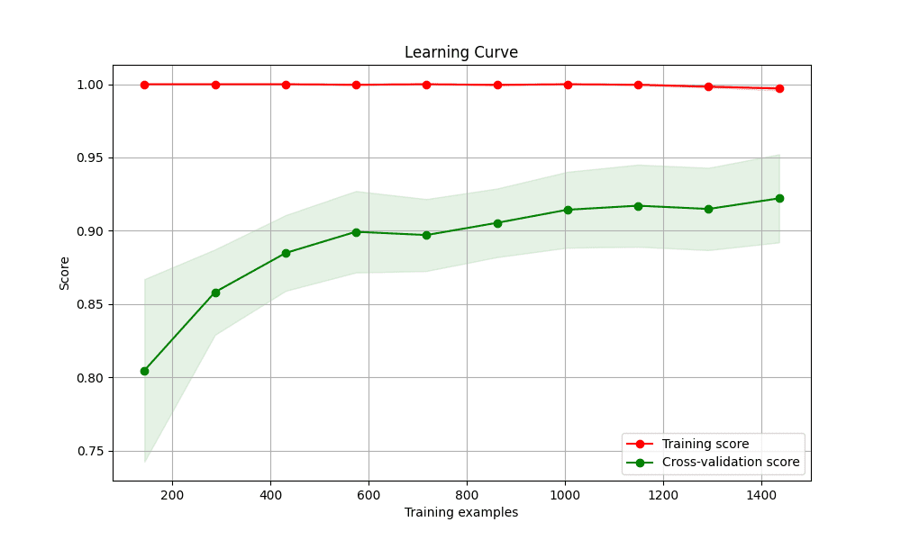
Plotting diagnostic learning curves
7. Creating a Gallery of Models with Subplots
There are times when you will want to compare the performance of several different models. Placing their visualizations side-by-side in a single figure makes this comparison direct and efficient. Matplotlib’s subplot functionality is perfect for creating this kind of “model gallery.”
We’ll create a grid of plots, with each subplot showing the decision boundary for a different classifier on the same dataset.
|
1 2 3 4 5 6 7 8 9 10 11 12 13 14 15 16 17 18 19 20 21 22 23 24 25 26 27 28 29 30 31 32 33 34 35 36 37 38 39 40 41 42 43 44 45 46 47 48 49 50 51 52 53 54 55 |
import numpy as np import matplotlib.pyplot as plt from sklearn.model_selection import train_test_split from sklearn.preprocessing import StandardScaler from sklearn.datasets import make_moons from sklearn.neighbors import KNeighborsClassifier from sklearn.svm import SVC from sklearn.tree import DecisionTreeClassifier from sklearn.ensemble import RandomForestClassifier # Create a dataset X, y = make_moons(noise=0.3, random_state=42) X = StandardScaler().fit_transform(X) X_train, X_test, y_train, y_test = train_test_split(X, y, test_size=.4, random_state=42) # Define classifiers classifiers = { "KNN": KNeighborsClassifier(3), "Linear SVM": SVC(kernel="linear", C=0.025), "RBF SVM": SVC(gamma=2, C=1), "Decision Tree": DecisionTreeClassifier(max_depth=5), "Random Forest": RandomForestClassifier(max_depth=5, n_estimators=10, max_features=1), } # Create a mesh grid x_min, x_max = X[:, 0].min() - .5, X[:, 0].max() + .5 y_min, y_max = X[:, 1].min() - .5, X[:, 1].max() + .5 xx, yy = np.meshgrid(np.arange(x_min, x_max, 0.02), np.arange(y_min, y_max, 0.02)) # Create subplots fig, axes = plt.subplots(1, len(classifiers), figsize=(15, 4)) for i, (name, clf) in enumerate(classifiers.items()): ax = axes[i] clf.fit(X_train, y_train) score = clf.score(X_test, y_test) # Plot decision boundary Z = clf.predict(np.c_[xx.ravel(), yy.ravel()]) Z = Z.reshape(xx.shape) ax.contourf(xx, yy, Z, cmap=plt.cm.RdBu, alpha=.8) # Plot training and test points ax.scatter(X_train[:, 0], X_train[:, 1], c=y_train, cmap=plt.cm.RdBu, edgecolors='k') ax.scatter(X_test[:, 0], X_test[:, 1], c=y_test, cmap=plt.cm.RdBu, edgecolors='k', alpha=0.6) ax.set_xlim(xx.min(), xx.max()) ax.set_ylim(yy.min(), yy.max()) ax.set_xticks(()) ax.set_yticks(()) ax.set_title(name) ax.text(xx.max() - .3, yy.min() + .3, f'{score:.2f}'.lstrip('0'), size=15, horizontalalignment='right') plt.tight_layout() plt.show() |
Here are the gallery of the various different classifier’s decision boundaries
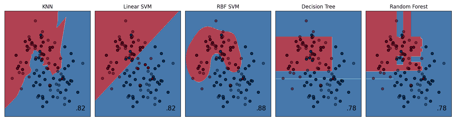
Creating a gallery of models with subplots
总结
Mastering these 7 Matplotlib tricks will significantly enhance your ability to analyze, diagnose, and communicate the results of your machine learning models. Effective visualization is not only about creating pretty pictures; it’s about crafting and presenting a deeper intuition for how models work and conveying complex findings in a clear, impactful way. By moving beyond default plots and thoughtfully crafting your visualizations, you can accelerate your own understanding and more effectively share your insights with others.


Very useful tips! These Matplotlib tricks make ML model visuals much clearer and more insightful.
不客气!