SHAP 在基于树的模型中的温和介绍
作者提供图片
引言
机器学习模型越来越复杂,但这种复杂性往往以牺牲可解释性为代价。你可以构建一个在房屋数据集上表现出色的XGBoost模型,但当利益相关者问“为什么模型预测了某个特定价格?”或者“哪些特征驱动了我们的预测?”时,你往往只能提供特征重要性排名之外的有限答案。
SHAP(SHapley Additive exPlanations)通过提供一种原则性的方法来解释个体预测和理解模型行为,从而弥合了这一差距。与只能告诉你哪些特征通常很重要的传统特征重要性度量不同,SHAP能准确地展示每个特征如何影响你模型做出的每一个单独的预测。
对于XGBoost、LightGBM和Random Forest等树模型,SHAP提供了特别优雅的解决方案。树模型通过一系列分割来做决策,SHAP可以追踪这些决策路径,并以数学精度量化每个特征的贡献。这意味着你可以超越“黑箱”预测,提供清晰、可量化的解释,以满足技术团队和业务利益相关者的需求。
在本文中,我们将探讨如何将SHAP应用于树模型,使用一个经过优化的XGBoost回归器。你将学会解释个体房屋价格预测,理解整个数据集的全局模式,并有效地传达模型洞察。最终,你将拥有实用的工具,让你的树模型不仅准确,而且可解释。
构建在我们的XGBoost基础之上
在我们探索SHAP解释之前,我们需要一个表现良好的模型来解释。在我们上一篇关于XGBoost的文章中,我们为Ames Housing数据集构建了一个优化的回归模型,该模型取得了0.8980的R²得分。该模型展示了XGBoost在处理缺失值和分类数据方面的原生能力,同时使用递归特征消除(RFECV)来识别最具预测性的特征。
以下是我们完成工作的快速回顾
- 原生数据处理:XGBoost自动处理了829个缺失值,无需手动填充
- 分类编码:将分类特征转换为数字编码以获得最佳的树分割
- 特征优化:RFECV从原始的83个特征中识别出36个最优特征,平衡了模型复杂度和预测性能
- 强大的性能:通过仔细调整和特征选择,实现了0.8980的R²
现在我们将重现这个优化的模型,并应用SHAP来精确理解它是如何做出预测的。
|
1 2 3 4 5 6 7 8 9 10 11 12 13 14 15 16 17 18 19 20 21 22 23 24 25 26 |
# 构建我们之前的XGBoost模型优化 import pandas as pd import numpy as np import xgboost as xgb import matplotlib.pyplot as plt from sklearn.feature_selection import RFECV from sklearn.model_selection import train_test_split # 加载数据集(与我们之前的XGBoost博文相同) Ames = pd.read_csv('Ames.csv') # 将选定的特征转换为“object”类型,以便将其视为分类特征 for col in ['MSSubClass', 'YrSold', 'MoSold']: Ames[col] = Ames[col].astype('object') # 将所有object类型的特征转换为category,然后转换为codes categorical_features = Ames.select_dtypes(include=['object']).columns for col in categorical_features: Ames[col] = Ames[col].astype('category').cat.codes # 选择特征和目标 X = Ames.drop(columns=['SalePrice', 'PID']) y = Ames['SalePrice'] print(f"数据集已加载:{X.shape[0]} 栋房屋,{X.shape[1]} 个特征") print(f"目标变量:SalePrice (平均值:${y.mean():,.2f})") |
输出
|
1 2 |
Dataset loaded: 2579 houses, 83 features Target variable: SalePrice (mean: $178,053.44) |
数据准备就绪后,我们将应用与我们表现最佳的模型相同的RFECV优化过程
|
1 2 3 4 5 6 7 8 9 10 11 12 13 14 15 16 17 18 19 20 21 22 23 24 25 26 27 |
# 使用RFECV特征选择重现我们优化的XGBoost模型 xgb_model = xgb.XGBRegressor(seed=42, enable_categorical=True) rfecv = RFECV(estimator=xgb_model, step=1, cv=5, scoring='r2', min_features_to_select=1) # 拟合RFECV以获得最优特征(这将为我们提供36个特征) print("正在使用RFECV进行特征选择...") rfecv.fit(X, y) # 获取选定的特征 X_selected = X.iloc[:, rfecv.support_] print(f"选定的最优特征数量:{rfecv.n_features_}") # 使用选定的特征对XGB模型进行交叉验证 cv_scores = cross_val_score(xgb_model, X.iloc[:, rfecv.support_], y, cv=5, scoring='r2') mean_r2 = cv_scores.mean() print(f"交叉验证R²得分:{mean_r2:.4f}") # 分割数据用于我们的SHAP分析 X_train, X_test, y_train, y_test = train_test_split( X_selected, y, test_size=0.2, random_state=42 ) # 训练我们的最终优化模型 final_model = xgb.XGBRegressor(seed=42, enable_categorical=True) final_model.fit(X_train, y_train) print(f"模型已在{X_train.shape[0]}栋房屋和{X_train.shape[1]}个特征上训练") |
输出
|
1 2 3 4 |
Performing feature selection with RFECV... Optimal number of features selected: 36 Cross-validated R² score: 0.8980 Model trained on 2063 houses with 36 features |
我们已经重现了我们高性能的XGBoost模型,拥有相同的36个精心挑选的特征和0.8980的R²性能。这为SHAP分析奠定了坚实的基础——当我们解释模型预测时,我们正在解释一个我们知道其表现良好且能有效泛化到新数据的模型的决策。
优化模型准备就绪后,我们现在可以探索SHAP如何帮助我们理解每个预测的驱动因素。
SHAP基础:模型解释背后的科学
SHAP有何不同
传统的特征重要性告诉你哪些变量在整个数据集中通常很重要,但它无法解释个体预测。如果你的XGBoost模型预测一栋房屋将售出180,000美元,标准的特征重要性可能会告诉你“OverallQual”是总体上最重要的特征,但它不会告诉你这栋房屋的质量评级对180,000美元的预测贡献了多少。
SHAP通过将每个预测分解为各个特征的贡献来解决这个问题。每个特征都会获得一个SHAP值,表示它将预测从基线(模型的平均预测)移开的贡献。这些贡献是累加的:基线 + 所有SHAP值的总和 = 最终预测。
Shapley值的基础
SHAP建立在合作博弈论的Shapley值之上,该值提供了一种原则性的数学方法来在博弈中分配“功劳”给玩家。在机器学习中,“博弈”是做出预测,而“玩家”是你的特征。每个特征根据其在所有特征组合上的边际贡献获得功劳。
这种方法的优点在于它满足了几个理想的属性
- 效率:所有SHAP值加起来等于预测值与基线值之差
- 对称性:贡献相等的特征获得相等的SHAP值
- 虚拟性:不影响预测的特征获得零SHAP值
- 可加性:该方法在不同的模型组合中都能一致工作
选择正确的SHAP解释器
SHAP提供了针对不同模型类型优化的不同解释器
TreeExplainer专为XGBoost、LightGBM、RandomForest和CatBoost等树模型设计。它利用树结构高效地计算精确的SHAP值,使其在我们的用例中既快速又准确。
KernelExplainer将模型视为黑箱,可用于任何机器学习模型。它通过训练一个代理模型来近似SHAP值,使其模型无关但计算成本高昂。
LinearExplainer通过直接使用模型系数,为线性模型提供快速、精确的SHAP值。
对于我们的XGBoost模型,TreeExplainer是最佳选择。它可以在几秒钟内计算出精确的SHAP值,而不是几分钟,并且它理解树模型是如何实际做出决策的。
为我们的模型设置SHAP
在继续之前,如果尚未安装SHAP,则需要安装它。你可以使用pip安装,命令为pip install shap。有关详细的安装说明和系统要求,请访问官方SHAP文档。
让我们初始化我们的SHAP TreeExplainer并计算测试集的SHAP值
|
1 2 3 4 5 6 7 8 9 10 11 12 13 14 15 16 17 18 19 20 21 22 |
#导入SHAP包 import shap # 为我们的XGBoost模型初始化SHAP TreeExplainer explainer = shap.TreeExplainer(final_model) # 计算我们测试集的SHAP值 print("正在计算SHAP值...") shap_values = explainer.shap_values(X_test) print(f"已为{shap_values.shape[0]}个预测计算SHAP值") print(f"每个预测由{shap_values.shape[1]}个特征解释") # 基准值(期望值)——模型“平均”预测的值 print(f"模型的基准预测(期望值):${explainer.expected_value:,.2f}") # 快速验证:SHAP值应该是可加的 sample_idx = 0 model_pred = final_model.predict(X_test.iloc[[sample_idx]])[0] shap_sum = explainer.expected_value + np.sum(shap_values[sample_idx]) print(f"验证 - 模型预测:${model_pred:,.2f}") print(f"验证 - SHAP总和:${shap_sum:,.2f} (差值:${abs(model_pred - shap_sum):.2f})") |
输出
|
1 2 3 4 5 6 |
Calculating SHAP values... SHAP values calculated for 516 predictions Each prediction explained by 36 features Model's base prediction (expected value): $176,996.61 Verification - Model prediction: $165,708.67 Verification - SHAP sum: $165,708.70 (difference: $0.03) |
验证步骤很重要——它证实了我们的SHAP值在数学上是一致的。模型预测与SHAP值总和之间的微小差异(通常小于1美元)表明我们获得的解释是精确的,而不是近似的。
SHAP解释器已准备就绪,值也已计算完毕,我们现在可以检查这些解释如何对单个预测起作用。
理解个体预测
SHAP的真正价值体现在您检查个体预测时。您不必猜测模型为何预测特定价格,而是可以看到每个特征如何影响该决策。让我们通过测试集中的一个房屋的具体示例来逐步说明。
分析单个房屋预测
我们将从选择一个有趣的房屋开始,并检查我们的模型预测了什么
|
1 2 3 4 5 6 7 8 9 10 11 12 13 14 15 16 17 18 19 20 21 22 23 24 25 26 |
# 选择一个有趣的预测进行解释 sample_idx = 0 # 你可以更改此值来探索不同的房屋 sample_prediction = final_model.predict(X_test.iloc[[sample_idx]])[0] actual_price = y_test.iloc[sample_idx] print(f"正在分析房屋索引 {sample_idx} 的预测:") print(f"预测价格:${sample_prediction:,.2f}") print(f"实际价格:${actual_price:,.2f}") print(f"预测误差:${abs(sample_prediction - actual_price):,.2f}") # 创建SHAP瀑布图 plt.figure(figsize=(12, 8)) shap.waterfall_plot( shap.Explanation( values=shap_values[sample_idx], base_values=explainer.expected_value, data=X_test.iloc[sample_idx], feature_names=X_test.columns.tolist() ), max_display=15, # 显示贡献最大的15个特征 show=False ) plt.title(f'我们的模型如何预测该房屋的价格为 ${sample_prediction:,.0f}', fontsize=14, fontweight='bold', pad=20) plt.tight_layout() plt.show() |
输出
|
1 2 3 4 |
Analyzing prediction for house index 0: Predicted price: $165,708.67 Actual price: $166,000.00 Prediction error: $291.33 |
我们的模型预测这栋房屋将售出165,709美元,非常接近其实际售价166,000美元——误差仅为291美元。但更重要的是,我们现在可以看到模型为何做出此预测。
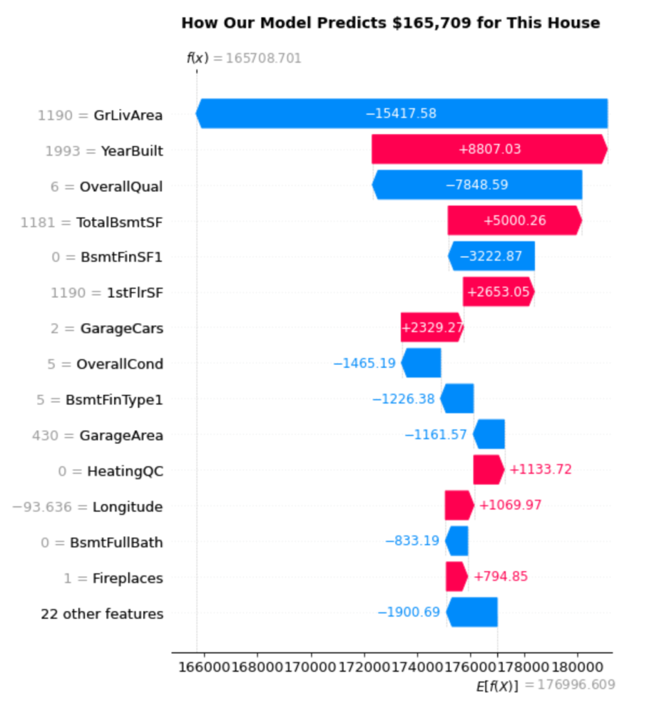
阅读瀑布图
瀑布图揭示了逐步的决策过程。以下是如何解读它
起点:模型的基准预测为176,997美元(在右下方显示为 E[f(X)])。这代表了模型在不知道特定房屋的任何信息时的平均房屋价格预测。
特征贡献:每个条形显示特定特征如何将预测值从基线向上(红色/粉色条形)或向下(蓝色条形)推
- GrLivArea(1190平方英尺):最大的负面影响为-15,418美元。该房屋的起居面积低于平均水平,显著降低了其预测价值。
- YearBuilt(1993年):一个强烈的正面贡献,为+8,807美元。建于1993年使其成为一个相对现代化的房屋,增加了可观的价值。
- OverallQual(6):另一个大的负面影响为-7,849美元。质量评级为6代表“良好”状况,但这显然未能达到推高价格的水平。
- TotalBsmtSF(1181平方英尺):正面贡献+5,000美元。地下室的平方英尺有助于提升价值。
最终计算:从176,997美元开始,加上所有个体贡献(总计-11,288美元),得到我们的最终预测165,709美元。
细分特征贡献
让我们更系统地分析贡献
|
1 2 3 4 5 6 7 8 9 10 11 12 13 14 15 16 17 18 19 20 21 22 |
# 分析我们样本房屋的特征贡献 feature_values = X_test.iloc[sample_idx] shap_contributions = shap_values[sample_idx] # 创建贡献的详细分解 feature_breakdown = pd.DataFrame({ 'Feature': X_test.columns, 'Feature_Value': feature_values.values, 'SHAP_Contribution': shap_contributions, 'Impact': ['Increases Price' if x > 0 else 'Decreases Price' for x in shap_contributions] }).sort_values('SHAP_Contribution', key=abs, ascending=False) print("对此次预测的前10个特征贡献:") print("=" * 60) for idx, row in feature_breakdown.head(10).iterrows(): impact_symbol = "↑" if row['SHAP_Contribution'] > 0 else "↓" print(f"{row['Feature']:20} {impact_symbol} ${row['SHAP_Contribution']:8,.0f} " f"(Value: {row['Feature_Value']:.1f})") print(f"\nBase prediction: ${explainer.expected_value:,.2f}") print(f"Sum of contributions: ${shap_contributions.sum():+,.2f}") print(f"Final prediction: ${explainer.expected_value + shap_contributions.sum():,.2f}") |
输出
|
1 2 3 4 5 6 7 8 9 10 11 12 13 14 15 16 |
Top 10 Feature Contributions to This Prediction: ============================================================ GrLivArea ↓ $ -15,418 (Value: 1190.0) YearBuilt ↑ $ 8,807 (Value: 1993.0) OverallQual ↓ $ -7,849 (Value: 6.0) TotalBsmtSF ↑ $ 5,000 (Value: 1181.0) BsmtFinSF1 ↓ $ -3,223 (Value: 0.0) 1stFlrSF ↑ $ 2,653 (Value: 1190.0) GarageCars ↑ $ 2,329 (Value: 2.0) OverallCond ↓ $ -1,465 (Value: 5.0) BsmtFinType1 ↓ $ -1,226 (Value: 5.0) GarageArea ↓ $ -1,162 (Value: 430.0) Base prediction: $176,996.61 Sum of contributions: $-11,287.91 Final prediction: $165,708.70 |
This breakdown reveals several interesting patterns
Size vs. Quality Trade-offs: The house suffers from below-average living space (1190 sq ft) but benefits from decent basement space (1181 sq ft). The model weighs these size factors heavily.
Age Premium: Being built in 1993 provides a significant boost. The model has learned that newer homes command higher prices, even when other factors aren’t optimal.
Quality Expectations: An OverallQual rating of 6 actually hurts this prediction. This suggests that in this price range or neighborhood, buyers expect higher quality ratings.
Garage Value: Having 2 garage spaces adds $2,329 to the prediction, showing how practical features influence price.
The Power of Individual Explanations
This level of detail transforms model predictions from mysterious black boxes into transparent, interpretable decisions. You can now answer questions like
- “Why is this house priced lower than similar homes?” (Below-average living area)
- “What’s driving the value in this property?” (Relatively new construction, good basement space)
- “If we wanted to increase the predicted value, what should we focus on?” (Living area expansion would have the biggest impact)
These explanations work for every single prediction your model makes, giving you complete transparency into the decision-making process. Next, we’ll explore how to understand these patterns at a global level across your entire dataset.
Global Model Insights
While individual predictions show us how specific houses are valued, we also need to understand broader patterns across our entire dataset. SHAP’s summary plot reveals these global insights by aggregating feature impacts across all predictions, showing us not just which features are important, but how they behave across different value ranges.
Understanding Feature Impact Patterns
Let’s create a SHAP summary plot to visualize these global patterns
|
1 2 3 4 5 6 7 8 9 10 11 12 13 |
# Create SHAP summary plot to understand global feature patterns plt.figure(figsize=(12, 10)) shap.summary_plot( shap_values, X_test, feature_names=X_test.columns.tolist(), max_display=20, # Show top 20 most important features show=False ) plt.title('Feature Impact Patterns Across All House Predictions', fontsize=14, fontweight='bold', pad=20) plt.tight_layout() plt.show() |
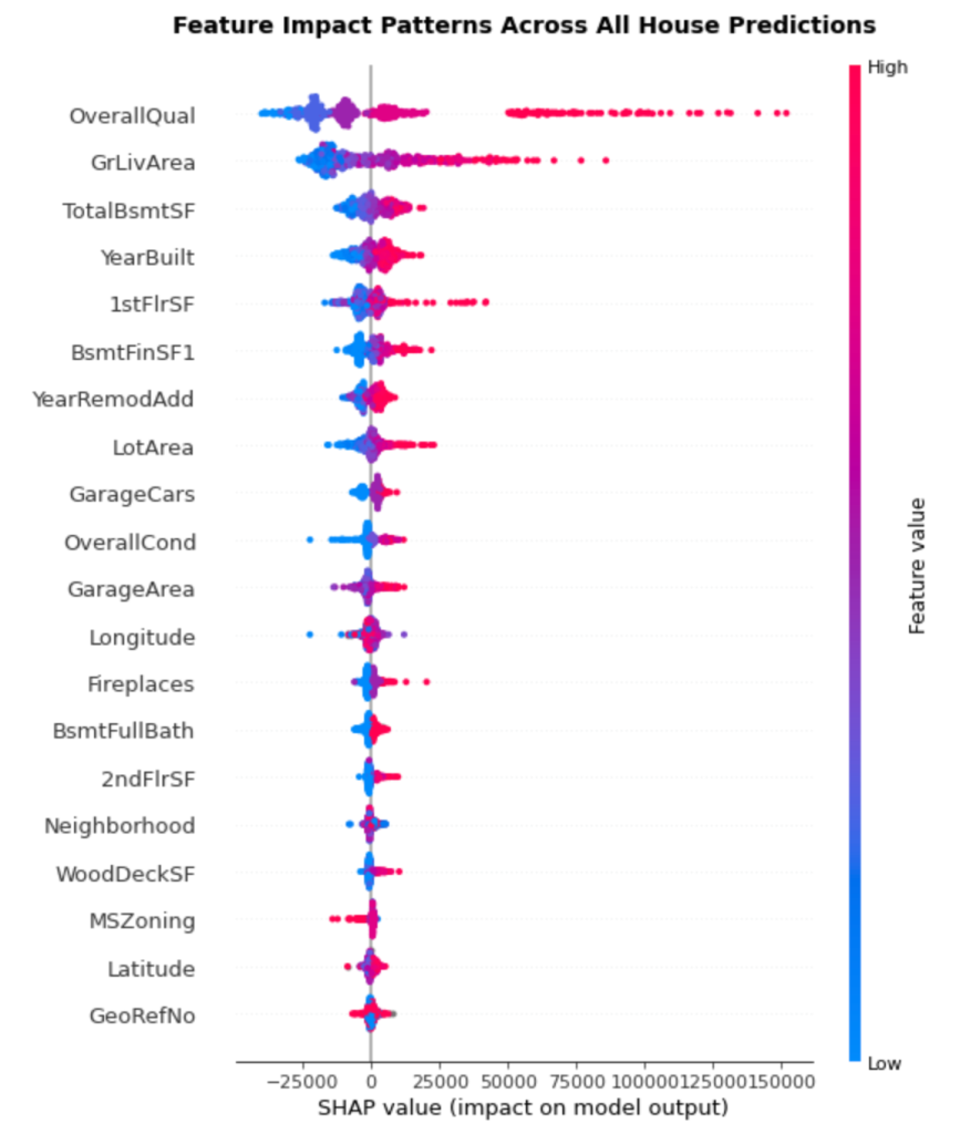
Reading the Summary Plot
The summary plot packs multiple insights into a single visualization
Vertical Position: Features are ranked by importance, with the most impactful at the top. This gives us a clear hierarchy of what drives house prices.
Horizontal Spread: Each dot represents one house prediction. The wider the spread, the more variably that feature impacts predictions. Features with tight clusters have consistent effects, while scattered features have context-dependent impacts.
Color Coding: The color represents the feature value—red indicates high values, blue indicates low values. This reveals how feature values correlate with impact direction.
Key Patterns from Our Results:
OverallQual dominates: Sitting at the top with the widest spread, overall quality clearly drives the most variation in predictions. High quality ratings (red dots) consistently push prices up, while lower ratings (blue dots) push prices down.
GrLivArea shows clear trends: The second most important feature demonstrates a clear pattern—larger living areas (red) generally increase prices, smaller areas (blue) decrease them. The wide horizontal spread shows this effect varies significantly across houses.
TotalBsmtSF has interesting complexity: While generally following the “more is better” pattern, you can see some blue dots (smaller basements) on the positive side, suggesting basement impact depends on other factors.
YearBuilt reveals age premiums: The pattern shows newer homes (red dots) typically add value, but there’s substantial variation, indicating age interacts with other features.
Comparing SHAP vs Traditional Feature Importance
SHAP importance often differs from traditional tree-based feature importance. Let’s compare them
|
1 2 3 4 5 6 7 8 9 10 11 12 13 14 15 16 17 18 19 20 21 22 23 24 25 26 27 28 29 |
# Compare SHAP importance with traditional feature importance print("Feature Importance Comparison:") print("-" * 50) # SHAP-based importance (mean absolute SHAP values) shap_importance = np.mean(np.abs(shap_values), axis=0) shap_ranking = pd.DataFrame({ 'Feature': X_test.columns, 'SHAP_Importance': shap_importance }).sort_values('SHAP_Importance', ascending=False) # Traditional XGBoost feature importance xgb_importance = final_model.feature_importances_ xgb_ranking = pd.DataFrame({ 'Feature': X_test.columns, 'XGBoost_Importance': xgb_importance }).sort_values('XGBoost_Importance', ascending=False) print("Top 10 Most Important Features (SHAP vs XGBoost):") print("SHAP Ranking\t\t\tXGBoost Ranking") print("-" * 60) for i in range(10): shap_feat = shap_ranking.iloc[i]['Feature'][:15] xgb_feat = xgb_ranking.iloc[i]['Feature'][:15] print(f"{i+1:2d}. {shap_feat:15s}\t\t{i+1:2d}. {xgb_feat}") print(f"\nKey Insights:") print(f"Most impactful feature: {shap_ranking.iloc[0]['Feature']}") print(f"Average SHAP impact per feature: ${np.mean(shap_importance):,.0f}") |
输出
|
1 2 3 4 5 6 7 8 9 10 11 12 13 14 15 16 17 18 19 |
Feature Importance Comparison: -------------------------------------------------- Top 10 Most Important Features (SHAP vs XGBoost): SHAP Ranking XGBoost Ranking ------------------------------------------------------------ 1. OverallQual 1. OverallQual 2. GrLivArea 2. GarageCars 3. TotalBsmtSF 3. 1stFlrSF 4. YearBuilt 4. Fireplaces 5. 1stFlrSF 5. GrLivArea 6. BsmtFinSF1 6. CentralAir 7. YearRemodAdd 7. BsmtQual 8. LotArea 8. KitchenQual 9. GarageCars 9. BsmtFullBath 10. OverallCond 10. MSZoning Key Insights: Most impactful feature: OverallQual Average SHAP impact per feature: $2,685 |
What the Differences Tell Us
The comparison reveals interesting discrepancies between how features appear in tree splits versus their actual impact on predictions
Consistent Leaders: Both methods agree that OverallQual is the top feature, validating its central role in house pricing.
Impact vs Usage: GrLivArea ranks highly in SHAP importance but lower in XGBoost importance. This suggests that while XGBoost doesn’t split on living area as frequently, when it does, those splits have major impact on final predictions.
Split Frequency vs Effect Size: Features like GarageCars and Fireplaces rank highly in XGBoost importance (frequent splits) but lower in SHAP importance (smaller actual impact). This indicates these features help with fine-tuning predictions rather than driving major price differences.
Global Insights for Decision Making
These patterns provide valuable insights for various stakeholders
For Real Estate Professionals: Focus on overall quality and living area when evaluating properties—these drive the largest price variations. Basement space and home age are secondary but still significant factors.
For Home Buyers: Understanding that quality ratings have the biggest impact can guide inspection priorities and negotiation strategies.
For Data Scientists: The differences between traditional and SHAP importance highlight why SHAP explanations are valuable—they show actual prediction impact rather than just model mechanics.
For Feature Engineering: Features with high SHAP importance but inconsistent patterns (like TotalBsmtSF) might benefit from interaction terms or non-linear transformations.
The summary plot transforms your 36 carefully selected features into a clear hierarchy of prediction drivers, moving from individual explanations to dataset-wide understanding. This dual perspective—local and global—gives you complete visibility into your model’s decision-making process.
Practical Applications & Next Steps
Now that you’ve seen SHAP in action with XGBoost, you have a framework that extends far beyond this single example. The TreeExplainer approach we’ve used here works identically with other gradient boosting frameworks and tree-based models, making your SHAP skills immediately transferable.
SHAP Across Tree-Based Models
The same TreeExplainer setup works seamlessly with other tree-based models you might already be using. TreeExplainer automatically adapts to different tree architectures—whether it’s LightGBM’s leaf-wise growth strategy, CatBoost’s symmetric trees and ordered boosting features, Random Forest’s ensemble of trees, or standard Gradient Boosting implementations. The consistency across frameworks means you can compare model explanations directly, helping you choose between different algorithms based not just on performance metrics, but on interpretability patterns. To understand these different tree-based models in detail, explore our previous articles on Gradient Boosting foundations, Random Forest and ensemble methods, LightGBM’s efficient training, and CatBoost’s advanced categorical handling.
Moving Forward with SHAP
You now have the tools to make any tree-based model interpretable. Start applying SHAP to your existing models—you’ll likely discover insights about feature interactions and prediction patterns that traditional importance measures miss. The combination of local explanations for individual predictions and global insights for dataset-wide patterns gives you complete transparency into your model’s decision-making process.
SHAP transforms tree-based models from black boxes into transparent, explainable systems that stakeholders can understand and trust. Whether you’re explaining a single house price prediction to a client or analyzing feature patterns across thousands of predictions for model improvement, SHAP provides the principled framework you need to make machine learning interpretable.


A detailed and complete blog. It was my first encounter with SHAP, and had some great learning along. Loved the way you gathered insights from the plots and code output.
Thanks, Vinod. Love and Respect form India.
Thank you for your feedback Ayush! Keep us posted on your progress!
Dear Ayush Singh: Thank you very much for your kind comments. I am glad to learn that you found this tutorial on SHAP helpful. I look forward to writing more about SHAP in subsequent posts as well. Your support is highly appreciated. Regards, Vinod
This blog post has taken my understanding of SHAP values to a higher level. Thank you for sharing your knowledge
不客气!
What happens when each sample has a lot of features, like over 2000? Figuring out which features matter most can be slow and expensive to compute. So how do we pick the top important ones efficiently?
Hi Joel…Great question. When each data sample has a lot of features—like over 2000—it can definitely become slow and expensive to compute SHAP values for every single feature. SHAP tries to fairly distribute credit for a prediction across all the features, but doing this for thousands of features and many samples can be overwhelming.
To deal with this, one common strategy is to use something called *approximate SHAP values*. Libraries like SHAP in Python offer faster, approximate algorithms—especially for tree-based models like XGBoost, LightGBM, or CatBoost. These approximations skip some of the heavy math and still give a good sense of which features are most important.
Another efficient approach is to
1. Use SHAP on a small random sample of your dataset instead of the full dataset.
2. Summarize the SHAP values across samples to rank the most important features.
3. Focus on just the top features—maybe the top 20 or 50—and ignore the rest.
This helps you zoom in on the most relevant features without needing to process all 2000. It’s a practical way to get insights without breaking your computer or spending too much time.